The Networks
#texasshooting
Generating networks from tweets
From the tweets we collected we are going to generate 2 of different networks
that we will be using throughout the rest of the analysis. In either network,
the nodes are going to be the users that have been tweeting about the event
using one of the predefined hashtags.
For the first network, the edges will be constructed through mentions in these
tweets. So, when a tweet mentions another user that is also a node in the
network, there will be an edge between these two nodes. We will refer to
this network as mention_graph.
For the second network, we define the edges between nodes if they share a
common hashtag, not including the query hashtags. For example, if two tweets
from different nodes use the hashtag #GunSense, we will create an edge
between them. We will refer to this network as hashtag_graph.
Stats
Below we have displayed some basic statistics about either graph.
| Mention Graph | Hashtag Graph | |
|---|---|---|
| Nodes | 15992 | 15992 |
| Edges | 1700 | 29894 |
| Average Degree | 0.21 | 3.74 |
| Components | 14501 | 15245 |
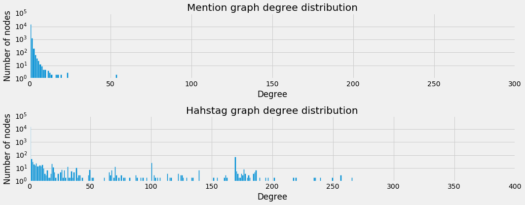
Degree Distribution
As we can see from the number of components in either graph, a large part of the networks is unconnected. This is further demonstrated by the degree distribution, which is shown below.
Components
The hashtag_graph seems to look somewhat linear on a logarithmic scale,
suggesting that the distribution follows a power law. However, the mention_graph
is still not linear which indicates an even more skewed distribution. Also,
we see a large peak in either graph for nodes with a degree of 0. This indicates
a large amount of singletons. This becomes more clear when we look at the
distribution of the components’ sizes, which is depicted below.
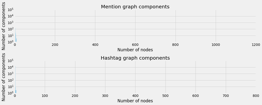
There are big peaks where the components sizes are very small and then almost nothing in the end. This makes it really hard to deal with the network as is.
Plots
A javascript library called d3js is used to plot these graphs in an interactive way, but it is clear that there is no good way to plot these.
You can use the buttons to inspect the different graphs and dynamically set the node size (either uniform or logarithmically dependent on their degree). When you hover over the nodes, you can see the screen_name of the user that each node represents.
Please not that some graphs load slowly due to their size.
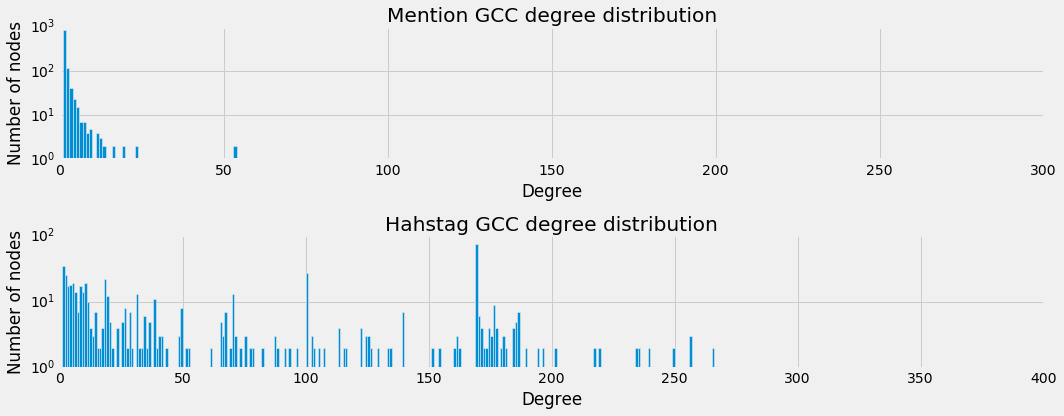
Giant Connected Components
As the the raw networks were very large and extremely sparse, we chose to only look at the Giant Connected Component (GCC) for the rest of the analysis.
Below we have a new overview of stats from these GCC’s for each graph.
Stats
| Mention GCC | Hashtag GCC | |
|---|---|---|
| Nodes | 1091 | 718 |
| Edges | 1211 | 29828 |
| Average Degree | 2.22 | 83.0863509749 |
| Components | 1 | 1 |
Degree Distribution
This comes with a new degree distribution of course, which is displayed below.
Plots
This makes for much nicer plots, which can be seen below. Again with the same controls.